What Napkin AI actually is
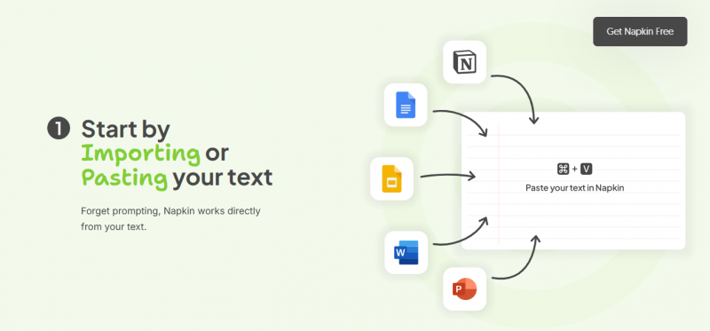
Napkin AI is a browser-based tool that turns plain written text into editable visuals. You paste a paragraph, a list of steps, or an outline, highlight it, and click a button the product genuinely calls Napkinify. In a few seconds the AI reads the structure of your words, decides what kind of graphic fits, and offers several visual options: flowcharts, process diagrams, timelines, comparison matrices, mind maps, funnels, and infographic-style concept art.
The detail that separates it from image generators is that everything it makes is fully editable. You get real shapes, real icons, and real text boxes you can rearrange, recolor, and rewrite, not a flat AI image. Finished visuals export to PNG, PDF, SVG, or PowerPoint, or copy straight into docs, slides, and tools like Notion, with support for more than 60 languages.
The origin scribble
The company was founded by Pramod Sharma and Jerome Scholler, the duo behind the AI-powered educational gaming company Osmo, which was acquired for $120 million in 2019. Napkin emerged from stealth in 2024 with $10 million in seed funding from Accel and CRV, and by 2025 it reported passing five million registered users while still run by a small team. For content creators the pitch landed because it attacks the exact bottleneck between writing and publishing: the visual.
Translation: it is not a design suite, it is a visual translator for your words.
From pasted text to posted graphic in five steps
The entire product fits in one pipeline, and reviewers consistently note that sign-up takes an email address and nothing else, with no onboarding maze before you are inside.
1. Paste Drop in your paragraph, outline, notes, or import a DOC, PPT, or PDF | 2. Napkinify Highlight the text and click. The AI reads hierarchy and relationships | 3. Pick Choose from several generated visual options in different framings | 4. Restyle Swap fonts, palettes, and icons, or apply brand colors on paid plans | 5. Export PNG, PDF, SVG, or PPT at 1x to 3x, with dark mode and transparency toggles |
Total honest time for a decent single visual: about one to two minutes.
What the AI is doing under the hood
Napkin reads the structure of your text rather than just its keywords. A list of steps becomes a flowchart or numbered process diagram. A comparison becomes a matrix. A cause-and-effect explanation becomes a relationship map. Because of this, structured writing produces dramatically better visuals than messy notes, which is the single most useful thing to know before using it. Hands-on testers also note the flip side: give it something ambiguous and it will make a choice for you, sometimes a bad one, and there is no prompt box to direct exactly which diagram type you want.
Built for sharing, not just making
The details that matter to creators are in the export panel. PPT exports keep text boxes individually editable with colors retained, so you can adjust a diagram after it lands in your deck. Resolution steps up to 3x for crisp social uploads, transparent backgrounds drop visuals onto any brand canvas, and a light and dark mode toggle covers both aesthetics. Real-time collaboration and element-level commenting exist too, though reviewers describe the collaboration layer as thinner than dedicated whiteboard tools like Miro.
Six recipes for shareable visuals
These are the plays working for creators right now, each with the input you feed Napkin and the output you publish.
The blog post infographic Take the core framework of a post you already wrote and Napkinify the summary paragraph. The resulting diagram becomes the featured image or a mid-post visual that keeps skimmers on the page. IN: your post’s key takeaways paragraph OUT: a branded PNG infographic at 2x | The LinkedIn carousel Break a long idea into five or six short sections and generate a visual for each. Export with consistent styling, drop them into a PDF, and you have a swipeable carousel without opening Canva. IN: one section of your framework per visual OUT: a multi-page PDF carousel |
The X and Threads explainer Text posts with a clean diagram attached consistently outperform walls of words. Napkinify your thread’s central concept and attach the visual to the first post as the scroll-stopper. IN: the one-sentence core of your thread OUT: a transparent-background concept visual | The newsletter section art Instead of stock photos, turn each issue’s main argument into a small process diagram or comparison matrix. It reads as substance, not decoration, and matches your brand palette on paid plans. IN: this week’s main argument, structured OUT: an on-brand inline graphic |
The video and course slide Educators and YouTubers use Napkin to storyboard explanations: timelines for history, flowcharts for tutorials, funnels for marketing lessons. PPT export keeps every element editable inside your deck. IN: your lesson outline, step by step OUT: editable PPT slides with diagrams | The pitch and client one-pager Consultants and freelancers turn proposals and strategy summaries into visual one-pagers. A framework that took a client call to explain becomes a single diagram they can forward internally. IN: your strategy summary or offer structure OUT: a clean PDF one-pager |
What it costs, served plainly
TODAY’S MENU
| PLAN | PRICE | WHAT YOU GET | BEST FOR |
|---|---|---|---|
| Free | $0 forever | Around 500 AI credits per week that reset every Monday, PNG and PDF export, unlimited visual editing, real-time collaboration, and file import, with a small Napkin watermark on exports | Trying the tool and casual weekly visuals where a watermark is acceptable |
| Plus | About $9 per month | More credits, watermark-free exports, and expanded export formats including SVG for crisp scaling anywhere | Solo creators publishing regularly who need clean, brandable output |
| Pro | About $22 per month | The highest credit allowance, full export formats including PPT workflows, brand controls, and priority features, with roughly 25 percent off on annual billing | Heavy users, consultants, and teams standardizing their visual output |
Chef’s note: prices move around in this category, so check the official site before ordering.
What stays on the napkin, and what spills
Keep: where it shines Speed. A visual that takes 30 to 60 minutes in a design tool takes one or two minutes here, which is the entire value proposition. Editability. Real vector shapes and text, not flat images, so nothing is locked after generation. Zero learning curve. Reviewers repeatedly note there is nothing to configure and no prompt engineering to learn. Structured text input. Lists, steps, and frameworks translate into polished diagrams with minimal cleanup. Creator-grade exports. Transparent backgrounds, 3x resolution, dark mode, SVG, and editable PPT. | Spill: where it slips No steering wheel. You pick from what the AI offers rather than telling it which diagram type you want, and ambiguous text can produce odd choices. Template fatigue. Heavy users notice the same visual patterns recurring after a while. No live data. It reads text, not spreadsheets, so real-number charts belong elsewhere. Watermarked free tier. The logo on free exports limits professional use until you pay. Not a full design suite. Pixel-precise custom illustration and complete deck building are jobs for Canva, Figma, or Gamma. |
What real users say
Feedback below is paraphrased from public review platforms and independent hands-on tests, pinned here like index cards. Star ratings reflect each source’s overall sentiment.
? ★★★★★ A G2 reviewer calls the product "so user friendly, fast to learn" and says the exported files are everything needed to move forward with a visual presentation, while another notes they just paste information and get back visuals that explain any workflow intuitively. The most cited nitpick on the platform: choosing between color options can be tricky. Verified business users G2 REVIEWS |
? ★★★★★ A hands-on reviewer at Concurate went in skeptical, expecting the AI to miss context, and changed their mind after the first pasted paragraph. They praise the near-instant email-only signup and the auto-saving project library for juggling client work, while flagging two consistent friction points including the watermark on free exports. Independent tester CONCURATE, 2026 |
? ★★★★★ TechSifted’s March 2026 review concludes the simple workflow claim is genuine, not marketing: paste, highlight, click, pick, export. Their criticisms are equally direct: the AI sometimes misreads intent on ambiguous text, there is no input to request a specific diagram type, and collaboration trails Miro and Lucidchart. Editorial reviewer TECHSIFTED, MARCH 2026 |
? ★★★★★ A synthesis of user sentiment at AI-Review finds people consistently praising the speed of turning notes into clear visuals and the branding customization, with marketers and startups the heaviest adopters. Collaboration features draw appreciation but are described as still evolving. Aggregated user sentiment AI-REVIEW PLATFORM SUMMARY |
? ★★★★★ The most tempered take, from AskYourBee’s July 2026 review: the tool genuinely delivers visuals in under ten seconds, but struggles with messy or abstract ideas, reuses the same visual templates over time, and the watermark makes the free tier awkward for published professional work. Editorial reviewer ASKYOURBEE, JULY 2026 |
The consensus in one line: reviewers agree on the speed and ease, agree on the structured-text sweet spot, and agree on the same three limits, steering, repetition, and the watermark. Remarkably little disagreement exists across sources for a tool this popular.
The Verdict
Should content creators use it?
APPROVED Yes, as your visual translator, not your design studio Napkin AI earns a place in a creator’s stack because it removes the single most common reason a good idea ships without a visual: the time cost. For diagrams, frameworks, processes, and concept graphics generated from words you already wrote, nothing in 2026 is faster, and the editable vector output means the result is a starting point you control rather than a flat image you settle for. Its limits are equally clear. It will not replace Canva for full designs, Gamma for entire decks, or a proper charting tool for live data, and free-tier watermarks push serious publishers toward the roughly $9 Plus plan quickly. Treat it as the fastest bridge between your draft and your feed, and it delivers. |
Start free if You publish occasionally, want to test the structured-text workflow, and can live with a watermark while you evaluate roughly 500 weekly credits. | Go paid if You publish weekly or serve clients. Watermark-free SVG and PPT exports plus brand styling pay for themselves in one saved design session. |
Post Comment
Share your thoughts about this article.
Be the first to post a comment!