Table of Content
Napkin made turning a paragraph into a diagram feel like nothing at all. The trouble starts once you want to edit the result, work on it with other people, feed it a PDF, or ship a whole deck. These six tools each answer one of those complaints.
Why people leave Napkin AI
Napkin AI does one thing extremely well. You paste text into a document, press a button, and within a few seconds it hands back tidy diagram options for that passage. That single trick is enough to have earned it more than five million users, and for drafting a quick visual inside something you are already writing, very little touches it.
The complaints show up later, and they are consistent. Once the diagram exists, there is not much you can change about it. The styling stays shallow, so a lot of the output carries the same faintly generic look. Two people cannot really shape the same visual together in real time. And the whole thing assumes you are starting from text you paste in, which is awkward if your source is a forty-page PDF or if what you actually need is a finished image to post, a branching mind map, or a full slide deck rather than a diagram wedged into a paragraph.
So the honest way to choose a replacement is to name the specific thing Napkin would not do for you, then pick the tool built around that thing. The six below are grouped that way rather than ranked one to six, because the best one genuinely depends on the job. Each profile ends with what real users are saying on G2, Capterra, and the app stores, so you are not taking only our word for it.
01 - Gamma
(Finished decks from a prompt)
WEB-BASED · TEXT-TO-DECK · FREE PLAN + CREDITS · PAID FROM ~$10/MO
Napkin gives you a graphic to drop into a document. Gamma gives you the document. You describe a topic in a sentence or two, and it builds a full run of designed slides, which Gamma calls cards, each one laid out with its own headings, images, and charts. From there you steer it through a conversational interface, asking for a different tone, a restyled deck, or a reworked card, rather than nudging shapes around by hand.
The reason to reach for it is scope. If the thing you are actually trying to make is a presentation or a long visual explainer, Gamma handles the parts that make decks tedious: keeping the narrative moving from card to card, holding one consistent design across twenty slides, and restyling the whole set in a click when you change your mind. The free tier is roomy enough to build something real before you decide to pay, and what comes out looks finished rather than like a rough draft you now have to polish in slide software.
That same ambition is the catch. For a single diagram destined for a blog post, which is exactly where Napkin shines, generating an entire deck is the wrong tool and more cleanup than you want. Its styling controls are lighter than a dedicated design suite, and a thin prompt tends to produce a few padding cards you will end up deleting.
| Ease of use ●●●●● | Editing control ●●●●○ |
| Collaboration ●●●●○ | Design polish ●●●●● |
| Value on free ●●●●○ |
WHAT REAL USERS SAY Around 4.1 on G2 and 3.7 on Capterra, but far lower on Trustpilot, where most one-star reviews come from people exporting to PowerPoint. The pattern is clear: reviewers who share as web links love it, while those who need a .pptx file are frustrated. Liked: Fast prompt-to-deck generation, professional-looking output, and link sharing that saves the endless back-and-forth of emailing slide files. Criticised: Exporting to PowerPoint breaks layouts and drops web-native elements, and fine design control is thinner than PowerPoint itself. “can feel limiting compared to PowerPoint” — Capterra reviewer, on precise design control |
| Best for: anyone whose real deliverable is a deck or a multi-part visual story, not one inline diagram. |
02 - Canva
(One tool for every visual)

WEB + MOBILE + DESKTOP · HUGE TEMPLATE LIBRARY · FREE PLAN · MAGIC AI TOOLS
Canva is not really a Napkin competitor so much as the larger world Napkin lives in. It is a general design platform where AI is one feature among hundreds, and it will make an infographic, a flowchart, a social post, a resume, or a full presentation without ever asking you to switch apps. The usual pattern is to let its AI rough out a first version, then take the wheel and adjust every element yourself, which is the control Napkin never offered.
Breadth is the whole argument. Whatever you need to make, there is almost certainly a template waiting, brand kits keep colours and fonts consistent across everything a team produces, and someone who has never opened a design tool can still get a respectable result on their first afternoon. The free plan does far more than most people expect, and because so much work already flows through Canva in schools and marketing teams, adopting it rarely means adding yet another subscription nobody wanted.
What you give up is Napkin's immediacy. The text-to-diagram step is neither as instant nor as narrowly tuned, so reaching a finished diagram takes a few more clicks and decisions. Lean on the free plan heavily and you will eventually bump into locked premium assets and a ceiling on AI credits.
| Ease of use ●●●●● | Editing control ●●●●● |
| Collaboration ●●●●○ | Design polish ●●●●● |
| Value on free ●●●●● |
WHAT REAL USERS SAY About 4.7 out of 5 on both G2 and Capterra, drawn from well over thirteen thousand reviews, which makes it one of the most heavily and consistently rated tools on this list. Liked: Ease of use for non-designers, a vast template library, genuine affordability versus professional suites, and one subscription covering many content types. Criticised: Premium templates and assets keep prompting upgrades on the free plan, and several reviewers find the phone app awkward for precise edits. “nearly impossible to use on your phone” — Capterra reviewer, on the mobile app |
| Best for: teams and creators who would rather own one flexible tool than a drawer full of single-purpose ones. |
03- Mermaid Chart
(Diagrams that behave like code)
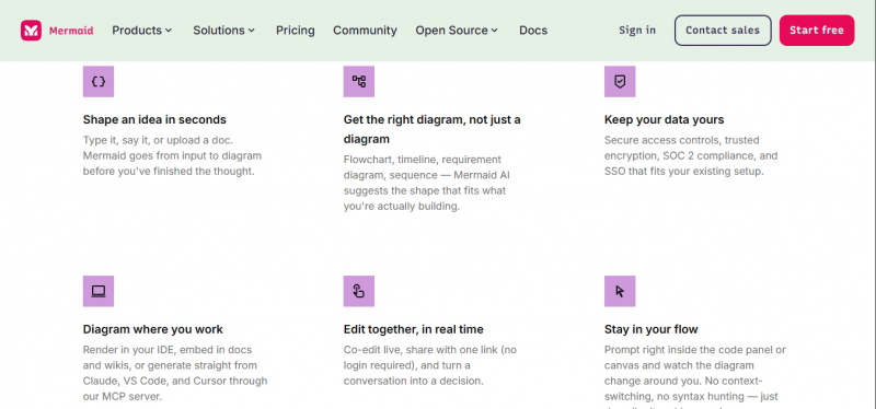
TEXT-SYNTAX-FIRST · AI FROM PROMPTS · FREE: UNLIMITED AI DIAGRAMS · GIT-FRIENDLY
Mermaid Chart comes at diagramming from the opposite direction to Napkin. Instead of a canvas, you write a short, Markdown-like syntax, and the tool renders the flowchart or sequence diagram for you. Nothing is ever dragged into position; the layout is a product of the text. People who already know the syntax build charts almost as fast as they can type, and anyone who does not can describe what they want in plain language and let the built-in AI return the syntax to tidy up. It covers the diagrams engineers actually reach for, including flowcharts, sequence diagrams, UML, and C4 context diagrams.
Because a diagram is just text, it slots into the way software teams already work. It sits in a git repository, shows up as a reviewable diff in a pull request, and stays in step with the documentation around it instead of quietly going stale in a slide somewhere. Reviewers keep coming back to the fact that it spares them the fiddly work of nudging boxes into alignment, and that it plugs cleanly into Confluence, Google Docs, Azure DevOps, and Word. Its free plan also allows unlimited AI diagrams, which almost nothing else on this list can claim.
None of that makes it a general-purpose visual tool. The syntax is a real, if short, learning curve, and the whole thing is pointed at technical accuracy rather than decoration. If you want something illustrative, warm, or brand-styled, you are at the wrong end of the market.
| Ease of use ●●●○○ | Editing control ●●●●● |
| Collaboration ●●●●○ | Design polish ●●●○○ |
| Value on free ●●●●● |
WHAT REAL USERS SAY Around 4.7 out of 5 on G2, though from a small pool of reviews, and it is reviewed largely by engineers and technical writers rather than general users. Liked: Plain-text simplicity, painless version control, and clean embedding in Markdown, wikis, and even Microsoft Teams chats. Criticised: Complex diagrams get hard to read as raw text, and the lack of drag-and-drop means auto-layout can misplace nodes you cannot simply move, so non-engineers struggle to edit them. “simplicity and flexibility in creating diagrams using plain text” — G2 reviewer |
| Best for: engineers and technical writers who need diagrams kept under version control and always in sync with the system. |
04 - Whimsical
(Fast, good-looking flows)
FLOWCHARTS + MIND MAPS · DOCS + BOARDS · FREE: 3 BOARDS · PRO ~$10/USER/MO
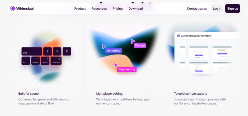
Whimsical is the tool on this list that feels most like Napkin in spirit while fixing the parts that frustrate people. It is a trim, deliberately uncluttered workspace for flowcharts, mind maps, wireframes, and docs, with AI that turns a plain prompt into something clean without much fuss. It lands between two extremes: lighter and quicker than a sprawling whiteboard, but with the real editing control and structure that Napkin's one-shot generation lacks.
Speed with polish is what people praise, and it is a fair reputation. Reviewers describe getting something genuinely presentable in about thirty seconds, and the interface is built for people who do not think of themselves as designers. Collaboration runs quietly through the whole product rather than being bolted on, so docs, boards, and notes all share the same space, and it connects to the tools teams already sit in, among them Notion, Jira, Confluence, and GitHub.
The free plan is where the limits bite. Three boards and a small pool of one-time AI prompts go quickly if Whimsical becomes part of your daily routine, and moving past that means paying. It is also happier with clear, moderately sized diagrams than with dense, deeply technical ones.
| Ease of use ●●●●● | Editing control ●●●●○ |
| Collaboration ●●●●○ | Design polish ●●●●○ |
| Value on free ●●●○○ |
WHAT REAL USERS SAY About 4.6 out of 5 on both G2 and Capterra, from a couple of hundred reviews, with small-business users making up the largest share. Liked: Intuitive drag-and-drop cards, quick workflow creation, handy colour coding, polished final designs, and easy link sharing. Criticised: The canvas can slow down once a board fills with text boxes, shapes, and arrows, and simultaneous editing gets chaotic when several people add cards at once. “Whimsical changed my daily workflow” — Capterra reviewer |
| Best for: individuals and small teams who want quick, tidy flows and mind maps with collaboration built in. |
05 - Venngage
(Turning data into infographics)
REPORTS + INFOGRAPHICS · CSV / SPREADSHEET IMPORT · FREE PLAN · PAID FROM ~$10/MO
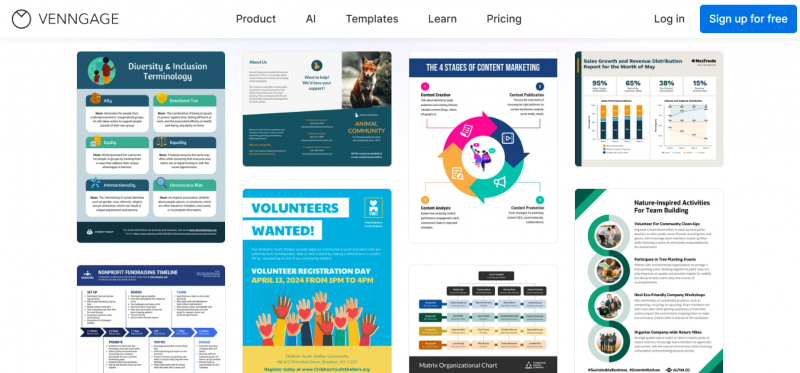
Venngage is aimed squarely at the moment when you have numbers and need them to look like something a stakeholder will read. It is a design suite for reports, infographics, and mind maps, and its most useful trick is pulling data straight from a spreadsheet or CSV so a column of figures becomes a chart without you retyping anything. By reputation it is a large operation, cited as serving well over five million professionals, and the product is built around business output rather than casual sketching.
Set against Napkin, the difference is focus. Napkin illustrates a paragraph; Venngage builds the annual report that paragraph belongs in. Branded templates keep a company's visuals consistent, the data import saves the tedious middle step between spreadsheet and slide, and the editor is approachable enough that someone with no design training can still produce a clean, on-brand deliverable. There is a free plan to start on, and the paid tiers stay within reach of small teams and individuals.
The trade is that Venngage is a design tool before it is an AI tool, so the instant prompt-to-visual sensation is not really the point here. Getting output that looks distinctly yours still means rolling up your sleeves in the editor, and the more capable features sit behind the paid plans.
| Ease of use ●●●●○ | Editing control ●●●●○ |
| Collaboration ●●●○○ | Design polish ●●●●○ |
| Value on free ●●●○○ |
WHAT REAL USERS SAY Roughly 4.6 out of 5 on Capterra across more than three hundred reviews and about 4.7 on G2, a strong and steady score for a design tool. Liked: Fast, professional infographics, versatile templates, smooth team collaboration, and responsive customer support. Criticised: Recolouring templates can be fiddly and the font choices feel limited, you cannot export editable source files, and the built-in AI generator is still maturing. “the easiest way I know of to make infographics” — Capterra reviewer |
| Best for: marketing teams, educators, and small businesses that need branded, data-heavy visuals and reports. |
06 - VisualNote AI
( A whole PDF into one visual )
PDF + TEXT INPUT · SKETCHNOTE OUTPUT · iOS APP · FREE TIER
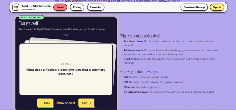
VisualNote AI exists to solve the input problem that Napkin never addresses. Rather than pasting paragraphs to get diagrams stitched into a document, you hand it an entire text or PDF and, in well under a minute, it returns a single sketchnote-style infographic that captures the whole thing. The output is one finished image you can download, post, or send, not a diagram trapped inside a document you happen to be editing.
The PDF pipeline is the reason it earns a place here. Drop in a long article, a research paper, or a report, and it produces a whole-document summary as one picture, which is a genuinely different job from illustrating a single sentence. It ships with an iOS app that also accepts voice memos and pasted links, offers a large range of visual styles, and has a free tier so you can see whether the format suits how you think before committing.
The flip side of that focus is that it does one broad format and does not pretend otherwise. You get a sketchnote or infographic-style summary rather than a library of precise diagram types, and it is built for condensing a source into a shareable whole, not for hand-editing a technical diagram or assembling a slide deck.
| Ease of use ●●●●● | Editing control ●●○○○ |
| Collaboration ●●○○○ | Design polish ●●●●○ |
| Value on free ●●●●○ |
WHAT REAL USERS SAY As a new indie tool it has no G2 or Capterra presence yet, so the honest picture comes from its App Store listing and the maker's own site rather than large review platforms. Treat the glowing testimonials on its website with the usual caution owed to vendor-published quotes. Liked: On the maker's site, users describe cramming whole chapters into a handful of visuals to study from, and teachers asking for a visual version of every lesson. Criticised: A real App Store reviewer hit a usage restriction soon after subscribing; the solo developer replied publicly that it was a temporary image-model fault fixed the same day, which is reassuring but points to early-stage rough edges. |
| Best for: students, researchers, and creators who want one shareable visual summary generated straight from a PDF or long text. |
The full comparison
Everything side by side. The first table covers what each tool is and costs; the second covers how they actually behave on the jobs people care about.
At a glance
| Tool | The gap it fills | Main output | Free plan | Paid from |
|---|---|---|---|---|
| Gamma | Full decks from a prompt | Multi-card decks | Yes + credits | ~$10/mo |
| Canva | One tool for any visual | Any design | Yes | ~$13/mo |
| Mermaid Chart | Diagrams in version control | Technical diagrams | Yes, unlimited AI | ~$7/mo |
| Whimsical | Fast, editable flows | Flowcharts, mind maps | Yes, 3 boards | ~$10/user |
| Venngage | Data-driven visuals | Reports, infographics | Yes | ~$10/mo |
| VisualNote AI | Visuals from a PDF | Sketchnote image | Yes | Low-cost tiers |
Capability by capability
| Capability | Gamma | Canva | Mermaid | Whims. | Venn. | Visual |
|---|---|---|---|---|---|---|
| Text-to-visual from a prompt | Yes | Yes | Yes | Yes | Yes | Yes |
| Builds a full deck | Yes | Yes | No | No | Partial | No |
| Deep manual editing | Some | Yes | Yes | Yes | Yes | No |
| Real-time collaboration | Yes | Yes | Yes | Yes | Limited | No |
| Import a PDF as source | Partial | No | No | No | No | Yes |
| Data / CSV to charts | Some | Yes | No | No | Yes | No |
| Version control friendly | No | No | Yes | No | No | No |
| Good for non-designers | Yes | Yes | Less | Yes | Yes | Yes |
| Unlimited AI on free plan | No | No | Yes | No | No | Limited |
| Mobile app | Web | Yes | Web | Web | Web | iOS |
Prices, plan limits, and feature availability move around a lot. Read these as 2026 estimates and check each vendor's own page before you pay. Scorecards and capability marks are editorial judgements, not vendor claims.
Choosing without overthinking it
| Forget the feature lists and answer two questions: where does your visual start, and where does it need to end up. Starting from text you are already writing and you just want a quick asset for a doc or post? Napkin itself is still hard to beat, with Whimsical and Gamma as the natural steps up. Starting from a PDF or a long source? VisualNote AI gives you a finished image. Needs to stay accurate inside a codebase? Mermaid Chart. Several people shaping it together? A collaborative tool like Whimsical. Working with real data? Venngage. And if you would rather learn one tool and never think about this again, Canva quietly does most of it. |
The bottom line
Napkin AI got popular by making one narrow task feel effortless, and it still owns that task. People go looking for something else the moment they need a job it was never meant to do, and that job is different for almost everyone. One person wants a finished deck, another wants a diagram that survives inside a repository, a third is staring at a PDF with no idea how to visualise it.
Name your gap and the choice makes itself. Gamma for decks, Canva for a bit of everything, Mermaid Chart for engineering-grade accuracy, Whimsical for quick flows you can actually edit, Venngage for anything data-heavy, and VisualNote AI for turning a whole PDF into a single image. Each of the six beats Napkin at the one thing Napkin was never built for, which is the only comparison that matters when you are the one who has to ship the visual.
Post Comment
Share your thoughts about this article.
Be the first to post a comment!