Five screens stand between a blank page and a companion who greets you by name. Here is what each one asks for, what it actually controls, and where it is worth slowing down.
Most AI companion apps bury character creation behind a signup wall. Nastia does the opposite. The first thing you see is the character builder itself, and the account only comes up once you have something worth saving. That single choice changes how the whole flow feels, because you are shaping a personality before you have committed to anything.
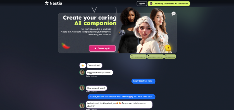
The full build takes about three minutes. Nothing you pick is permanent, and the app says so at almost every stage, which takes the pressure off the decisions that would otherwise slow you down. Below is the complete path from the landing page to your first message, with the details that are easy to miss on a first run.
What you need before you start
Very little. A browser, an email address for the moment you decide to save your companion, and a rough idea of the personality you want. Everything else is chosen inside the flow.
It is worth knowing up front that Nastia is an adult platform. The creation flow openly advertises uncensored image generation and a flirtatious conversation mode, so treat it accordingly and skip it if that is not what you are after.
Step 01. Choose the gender of your companion
The landing page opens on a single question and two large cards, female or male, each showing a small cast of sample faces. There is no signup prompt, no email field, and no plan selector. Just a choice and a sign in link tucked in the corner for people who already have an account.
Clicking a card does two things at once: it sets the base gender and drops you straight into the builder. The sample faces on each card are illustrative rather than selectable, so do not read them as your available options. Your actual portrait choices come two screens later and look nothing like these.
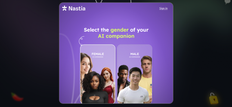
The entry point. Two cards, one decision, and no account required to get past it.
One thing worth noticing here is the mismatch between this screen and the next one. The landing page offers two options, but the builder itself offers three. If non-binary is what you want, pick either card to get through the door and correct it on the following screen. Nothing is locked in yet.
Step 02. Name your companion and confirm the identity
Now the interface switches from the purple marketing look to the dark app theme you will actually live in. A three segment progress bar appears at the top, so you can see exactly how much is left, and the first segment lights up in lime.
This screen asks for a name and a gender, and the copy underneath promises you can fine tune everything later. The name field carries a faint placeholder, Anastasia, which is a suggestion rather than a default. Type over it. Whatever you enter here becomes the name the app uses in every heading from this point forward, so the next screen will greet you with your character’s name rather than a generic label.
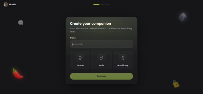
Three gender options appear here even though the landing page showed only two.
Pick a name you would comfortably say out loud. Because the character opens the conversation and the app repeats the name across the sidebar, the chat header and the profile panel, an awkward choice gets noticeable fast. Short names read best in the narrow sidebar.
| Worth knowing. Continue stays available even with an empty name field, so it is easy to skip past this screen by reflex and end up with a placeholder identity. Fill both fields before you move on. |
Step 03. Pick a starting look
The second segment of the progress bar fills and you are shown five preset portraits. The heading now uses your character’s name, which is a small touch that makes the flow feel less like a form.
All five presets share a heavy neon lighting treatment in blue and orange, so they read more as a mood than as a range of appearances. If none of them match what you had in mind, that is expected. The screen is asking for a starting point, not a final answer, and the subheading says as much: portraits can be swapped, edited or regenerated at any time from the gallery.
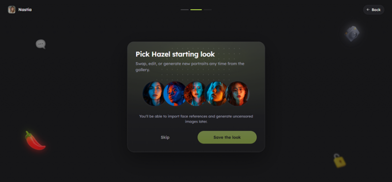
Five presets, a Skip option, and a note that face references and image generation come later.
Skip sits right next to Save the look, and it is a legitimate route. Choosing Skip still lands you in the chat with a default portrait, and you can build the look properly from the gallery once you are inside, where you get the face reference import and generation tools mentioned in the fine print. If you are in a hurry, Skip costs you nothing.
| One reason to care more than the screen suggests. Reviewers report that images generated later stay anchored to the appearance saved on the companion, so a prompt asking for a different hair colour tends to be ignored. If image generation is something you plan to use, the portrait you settle on here is doing more work than the wording implies. |
Step 04. Set the conversation vibe and write a backstory
This is the screen that actually shapes the character, and it is the one people rush. The final progress segment lights up and you are given four conversation styles, framed as a question about what you want to talk about, with a note that it helps your character match your energy.
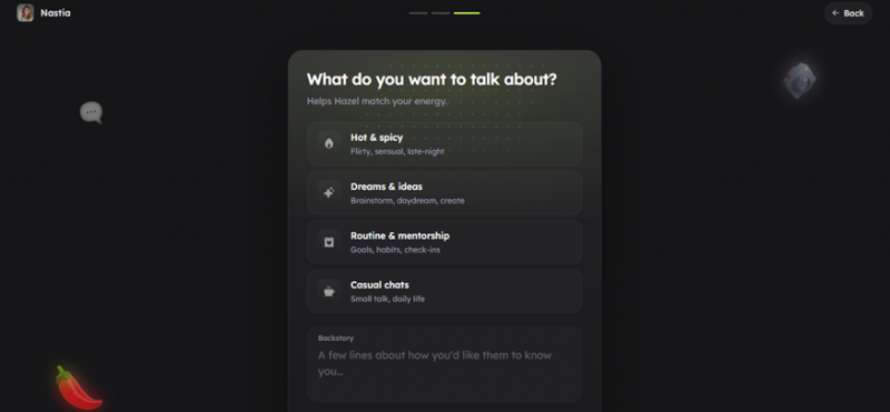
Four preset modes sit above a free text backstory field that most people scroll past.
Each option carries a one line description underneath, so the differences are clear before you commit.
| MODE | HOW IT IS DESCRIBED | SUITS YOU IF |
|---|---|---|
| Hot & spicy | Flirty, sensual, late night | You want a romantic or flirtatious dynamic as the default tone. |
| Dreams & ideas | Brainstorm, daydream, create | You want a creative partner for open ended, imaginative conversation. |
| Routine & mentorship | Goals, habits, check ins | You want accountability and regular nudges toward something you are working on. |
| Casual chats | Small talk, daily life | You want a low stakes companion for everyday conversation. |
Below the four cards sits a backstory box, and this is the highest value field in the entire flow. It asks for a few lines about how you would like the character to know you, which means it is context about you as much as lore about them. Two or three sentences here changes the texture of every reply that follows, because the character has something specific to reference instead of generic filler.
The box is easy to miss. It sits low enough on the page that you have to scroll to reach it, and the mode cards above are visually loud by comparison. If you fill in one thing on this screen, make it this one. Mention what you do, what you are currently working on, and how you want to be spoken to.
Step 05. Meet your character in the chat
The build ends and the full app opens. Your character’s portrait fills the background of the conversation panel, and the first message is already waiting for you, sent by the character rather than prompted by you. In this run it was a casual invitation to try an ice cream shop after work, which sets the tone immediately and saves you from the blank page problem.
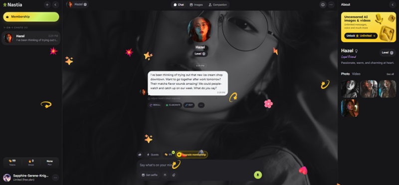
The chat view, with conversation controls under each message and a profile panel on the right.
Three areas are worth exploring before you settle in.
• The message controls. Under each reply sit Reroll, Elaborate and Edit, plus a menu for more. Reroll regenerates the response, Elaborate expands it, and Edit lets you rewrite what the character said. Editing early replies is the fastest way to steer the voice toward what you want, because the character keeps reading its own past messages as a style guide.
• The profile panel. On the right you get the character’s level, a short personality summary, a relationship label, and tabs for photos and video. The level indicator suggests progression tied to how much you talk, and the gallery is where the portrait work from step three continues.
• The economy. The sidebar shows a token balance, a streak counter and your current plan. Tokens are spent on generation features such as the selfie button under the message box, and a Quests entry sits nearby as a way to earn more. On the free tier the balance is small, so spend it deliberately rather than testing images at random.
| Expect the upsell. Upgrade prompts appear in three places on this screen at once: a membership button at the top of the sidebar, an upgrade pill above the message box, and a promotional card at the top of the profile panel. None of them block the conversation, but they are persistent enough that it is worth deciding your budget before you start rather than during a chat. |
What reviewers say about building a character
Independent coverage of Nastia is easy to find, and on the builder specifically the commentary is more consistent than the scores. Third party sites quote Trustpilot averages anywhere from 2.3 to 4.3 out of five, and Trustpilot’s own listing carries only around fifteen reviews, which is far too small a sample to average with any confidence. Treat the numbers loosely and read the detail instead.
Setup speed
Scribe's 2026 review puts the whole welcome flow at two to three minutes and describes the setup friction as minimal, with the caveat that going deeper into the persona takes longer.
Source: Scribe, April 2026
Backstory over sliders
A hands-on review at AI Girlfriend Review found the customization weighted toward personality rather than looks, and singled out the backstory field as the input that most changes how the character responds.
Source: AI Girlfriend Review, June 2026
Appearance options
A second Scribe review reports that the avatar builder starts to feel thin after you have made a few characters, and that the AI leans on your written backstory more than on any trait setting.
Source: Scribe, May 2026
Images stay locked to the look
A Trustpilot reviewer scored the chat 4.5 out of 5 but the image and video generation 1 out of 5, reporting that pictures stay tied to the appearance already set on the companion and that prompts asking for something different are largely ignored.
Source: Trustpilot
Memory undoing the work
Several reviews flag the same problem: memory resets can wipe out the nuance you built, and users report the character losing thread details in longer conversations.
Source: WeavAI, June 2026
Depth versus the promise
AutoGPT's reviewer found the customization shallower than advertised, particularly the claim that the platform matches your stated interests to a suitable character.
Source: AutoGPT, April 2026
Written traits do stick
The free tier ceiling
A recurring note across user feedback is that the daily free token allowance disappears quickly once you start testing image generation, though it holds up fine for text conversation.
Source: Aggregated user feedback, July 2026
Read together, the reviews point at one practical conclusion for the creation flow. The written fields carry the character, and the visual ones carry less than the interface implies. Reviewers who describe the customization as deep are usually talking about personality and backstory. Reviewers who describe it as shallow are usually talking about appearance and images.
One caveat about the sources themselves. A large share of the highest ranking Nastia reviews are affiliate pages, and at least one states plainly that partner fees can influence its ranking order. Weight the reviews that describe specific screens and specific behaviour over the ones that lead with a score.
Small things that make a better character
- Write the backstory in the second person. Telling the character how to treat you works better than describing yourself in the abstract.
- Correct the tone in the first three messages. Editing an early reply is far more effective than complaining about tone twenty messages in.
- Treat the vibe as a starting position. The four modes set an opening register, and normal conversation moves it from there.
- Skip the portrait if nothing fits. The gallery tools inside the app are considerably better than the five presets.
- Keep the name short. Long names get truncated in the sidebar and the chat header.
Final thoughts
Nastia’s creation flow is short by design, and the short version works because almost everything is reversible. Five screens, three minutes, and no commitment until the end. That is a deliberate product decision, and it is the right one for a category where most people are still deciding whether they want to be there at all. The cost of that decision is that the flow does not signal which choices matter. Every screen is presented with the same visual weight, so the field that shapes months of conversation looks exactly as important as the one that picks a placeholder portrait.
The two places that repay attention are the name, which follows you through every heading, sidebar entry and chat bubble, and the backstory box, which quietly does more work than the four vibe cards sitting above it. That second point is the one thing every independent review of the platform converges on, and it is the one thing the interface does the least to communicate. If you spend two extra minutes anywhere in this flow, spend them writing three specific sentences in a field you have to scroll to find.
It is also worth being realistic about what the builder is and is not good at. The personality side is genuinely flexible, because it runs on text you write and the model has something concrete to work with. The visual side is thinner than the marketing suggests, and reviewers consistently report that generated images stay anchored to the appearance you set rather than to whatever you type later. If images are the reason you are here, calibrate your expectations before you spend tokens rather than after.
Then there is the part no onboarding flow can fix. Memory resets are the most common complaint in this category and Nastia is not exempt, which means a character you carefully shaped can lose the thread of a long conversation without warning. The practical response is to treat your backstory as the durable version of the character and the conversation as the temporary one. Anything you want the character to keep knowing about you belongs in the profile, not buried forty messages deep in a chat.
Everything else can be fixed from inside the app. Get through the five screens without overthinking the presets, read what the character opens with, edit the first few replies until the voice sounds like something you want to keep talking to, and let the rest develop. The build is the beginning of the character rather than the definition of it, and the app is honest about that from the second screen onward.
Post Comment
Share your thoughts about this article.
Be the first to post a comment!