The Feature Treadmill
Most software today is not getting better. It is getting bigger. Usage data shows roughly 80% of features in a typical product are rarely or never used, while the average desk worker now juggles nearly twice as many apps as in 2019.
The Giant knife is a perfect picture of modern software. Every tool works. Together, they make something nobody wants to use. This pattern has a name, feature creep, and it has quietly become the default way products grow.
This article asks a simple question with hard numbers: are we building better tools, or just adding more features? The short answer is that most teams are adding, and their users are paying for it in time, focus and money.
Most Features Go Unused

Just 12% of features generate 80% of daily usage in the average software product. That finding comes from Pendo's Feature Adoption Report, which analyzed usage across 615 product subscriptions with more than a year of data.
The flip side is harsher. The same study found that 80% of features are rarely or never used. Pendo then put a price on it: a software company with $50 million in revenue might spend about $8.4 million building features customers barely touch. Across public cloud companies, the estimate reached $29.5 billion.
| Metric | Finding | Source |
|---|---|---|
| Features driving 80% of daily usage | 12% | Pendo Feature Adoption Report |
| Features rarely or never used | 80% | Pendo Feature Adoption Report |
| R&D spent on rarely used features (per $50M company) | $8.4 million | Pendo Feature Adoption Report |
| Public cloud R&D on rarely used features | $29.5 billion | Pendo Feature Adoption Report |
| SaaS licenses unused or underused | 65% | Torii SaaS Statistics 2026 |
The waste is not only in what vendors build. It is also in what buyers pay for. Torii's 2026 research found that 65% of SaaS licenses sit unused or underused. Companies are buying seats for tools that nobody opens, filled with features that nobody clicks.
Tool Sprawl
The Hidden Tax on Attention
Workers lose about 9% of their working year just reorienting after switching apps. That is the headline from a Harvard Business Review study that tracked 137 users across 20 teams at three Fortune 500 companies for up to five weeks.
The researchers found the average user toggled between apps and websites nearly 1,200 times a day. Each switch cost a little over two seconds to refocus. Small on its own, those seconds added up to just under four hours a week, or roughly five working weeks a year.
The app count keeps rising. Gartner found the average desk worker used 11 applications for work, up from 6 in 2019. Okta's Businesses at Work 2025 report showed the average company now deploys 101 apps, crossing 100 for the first time. Torii's discovery data, which also catches unapproved tools, counts 831 apps in the average organization.
| Sprawl signal | Number | Source |
|---|---|---|
| App toggles per worker per day | ~1,200 | Harvard Business Review, 2022 |
| Share of work time lost to reorienting | ~9% | Harvard Business Review, 2022 |
| Apps used by the average desk worker | 11 (up from 6 in 2019) | Gartner, 2023 |
| Apps deployed by the average company | 101 | Okta, Businesses at Work 2025 |
| Hours lost per employee each week to fragmented tools | ~7 | Freshworks, Cost of Complexity |
| Enterprise apps that connect to each other | 27% | MuleSoft, 2026 Connectivity Benchmark |
| IT pros who see clear tool overlap | 74% | Ivanti, 2025 DEX Report |
The most telling number may be the last one. Ivanti found that 74% of IT professionals see clear overlap and redundancy in their tools, yet 63% say consolidation is not a high priority. Everyone sees the mess. Few are cleaning it up.
Why Companies Keep Adding Features
Feature creep is rarely a design failure. It is an incentive problem. Teams are rewarded for shipping, not for removing, so the product grows in one direction only.
Five forces keep the treadmill running:
• Roadmaps measure output. Release notes and launch counts are easy to report. Adoption, time saved and fewer support tickets are harder to show, so they get less attention.
• Sales checklists drive the backlog. One large prospect asks for a niche capability, and it ships for everyone. Comparison grids reward the longest list, not the best workflow.
• Competitors copy each other. When a rival launches something, matching it feels safer than ignoring it, even when few customers asked.
• Removal feels risky. Deleting a feature can upset a small, loud group of users. Keeping it costs nothing visible, so it stays forever.
• Pricing rewards bundles. Higher tiers need more features to justify the price, so vendors pack them with extras rather than better core tools.
The result is a product that looks stronger in a demo and feels weaker in daily use. Every new menu item makes the useful ones a little harder to find.
The AI Layer
More Features, Unclear Value
AI is now the fastest way to add features, and the data shows a wide gap between adding AI and getting value from it. Torii's discovery data counted 694 new AI-native apps in 2025, up from just 11 in 2020.
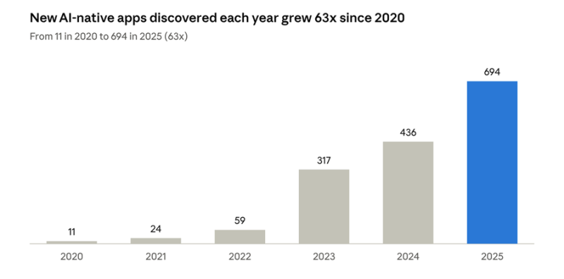
The value has not kept pace with the volume. In McKinsey's State of AI 2025 survey, 64% of respondents said AI is enabling innovation, yet only 39% reported any EBIT impact at the enterprise level. Most of those said AI drives less than 5% of their EBIT.
The picture from MIT is starker. As Fortune reported, MIT's NANDA initiative found that about 95% of generative AI pilots at companies were delivering little to no measurable impact on profit and loss. The research pointed to weak integration into real workflows, not weak models, as the main cause.
| AI signal | Number | Source |
|---|---|---|
| AI-powered apps per organization | 27 (about 22% of the portfolio) | BetterCloud, 2026 State of SaaS |
| Orgs reporting any enterprise EBIT impact from AI | 39% | McKinsey, State of AI 2025 |
| Gen AI pilots with no measurable P&L impact | ~95% | MIT NANDA, via Fortune |
| Professionals saying AI ROI met expectations | 22% | ISACA, 2026 AI Pulse Poll |
This is feature creep at a new speed. An AI button inside every app is easy to ship. An AI that removes three steps from a real workflow is hard to build, and that is where the value lives.
What Better Tools Actually Look Like
A better tool is measured by the work it removes, not the features it adds. The products people love tend to share a few traits, and none of them show up on a feature checklist.
| Feature-first product | Better tool |
|---|---|
| Measures success by features shipped | Measures success by tasks completed and time saved |
| Adds a new menu for every request | Improves the core workflow most people use daily |
| Keeps every feature forever | Retires features with low adoption on a set schedule |
| Bolts AI onto every screen | Uses AI to remove specific steps from real work |
| Lives in its own silo | Connects cleanly with the tools people already use |
| Wins demos | Wins the tenth week of daily use |
Three principles separate the two:
1. Depth over breadth. If 12% of features drive 80% of usage, the best investment is usually making that 12% faster, clearer and more reliable.
2. Subtraction as a skill. Strong product teams treat removing a feature as a win. A smaller surface means less to learn, less to maintain and fewer bugs.
3. Fewer handoffs. With only 27% of enterprise apps connected to each other, integration often creates more value than any new capability. Every switch you remove gives back seconds that add up to weeks.
Lessons From Products That Chose Focus
The best proof that subtraction works comes from companies that tried it at scale. Three cases stand out, and each one changed a product by making it simpler, not bigger.
Microsoft Office 2007: the features were already there. By the mid 2000s, Office had grown to roughly 2,500 features. Microsoft's research found that about 90% of the feature requests it received were for things Office could already do. Users simply could not find them. Instead of adding more, the team rebuilt the interface around the Ribbon. Microsoft later reported that Word and Excel users were using about four times as many features as before, and PowerPoint users about five times as many.
Google's spring cleaning: focus over sprawl. In 2013, Google shut down Google Reader and seven other products, bringing the total closed since its 2011 cleanup effort to 70. The company said it needed to stop spreading itself too thin. Many of the retired services duplicated other Google products. The move was unpopular with Reader fans, which shows why removal takes courage.
Apple in 1998: four products instead of dozens. When Steve Jobs returned to Apple, the company sold a confusing range of overlapping models. He cut the lineup down to a simple grid of four computers: consumer and professional, desktop and portable. That focus helped set up the iMac and the turnaround that followed.
| Company | What they cut or simplified | What it showed |
|---|---|---|
| Microsoft | Menus and toolbars replaced by the Ribbon | Discovery, not more features, was the real gap |
| 70 products and features retired from 2011 to 2013 | Duplicates drain focus and resources | |
| Apple | Dozens of models cut to 4 | A smaller lineup is easier to buy and build |
The common thread is simple. Each team stopped asking what else it could add and started asking what was getting in the way.
Metrics That Separate Better Tools From Bigger Ones
What a team measures decides what it builds. If the only number on the dashboard is features shipped, the product will keep growing whether or not it gets better.
These metrics shift the focus from output to outcomes:
| Metric | What it tells you | Warning sign |
|---|---|---|
| Feature adoption rate | Share of active users who use a feature regularly | Under 10% after 90 days |
| Usage concentration | Share of daily activity driven by your top features | A few features carry almost everything, the rest are dead weight |
| Time to value | How long a new user takes to finish their first real task | Rising with each release |
| Task completion time | Minutes to complete a core workflow | Flat or rising while features grow |
| App switches per task | How often users leave your tool to finish a job | More than a handful for routine work |
| License utilization | Share of paid seats active in the last 30 days | Under 70% |
| Support tickets per 1,000 users | How much confusion the product creates | Climbing after launches |
The goal is not to track all of these at once. Pick two that match your biggest problem and review them every quarter. A product that ships fewer features but cuts task time in half is the better tool, even if its release notes look thin.
A Practical Checklist for Builders and Buyers
Both sides of the market can break the cycle with a few simple habits.
For product teams
• Tag every feature and track its adoption before planning the next one
• Set an adoption target for each new feature at launch, and review it after 90 days
• Run a quarterly "sunset review" and retire anything below your usage threshold
• Ask "what step does this remove?" before approving any AI feature
• Report time saved and tasks completed alongside features shipped
For software buyers and IT leaders
• Audit actual license usage, since up to 65% of seats can sit idle
• Map which tools overlap and pick one owner per job to be done
• Favor tools that integrate with your core stack over standalone point tools
• Pilot AI tools against one measurable workflow, not a general promise
• Count app switches for one high-volume team, then target the worst handoffs first
Conclusion
Build Less, Help More
The numbers point one way. We are mostly adding features, not building better tools. Eight in ten features go unused, workers lose about 9% of their year to app switching, and only a small share of AI projects show real financial returns.
The fix is not to stop building. It is to change what counts as progress. A release that removes a step, connects two tools or makes the core 12% faster is worth more than ten new menu items.
The next great product will not be the one with the most features. It will be the one people barely notice, because it simply gets the work done.
Post Comment
Share your thoughts about this article.
Be the first to post a comment!