A law firm website that looks professional is not the same as a law firm website that generates clients. This distinction is more important than it might initially seem, and it explains why many law firms have invested in websites that cost real money, look polished, and produce almost no inbound business.
The reason is that legal website design has historically been driven by two priorities: establishing credibility and complying with bar association advertising rules. Both are legitimate concerns. Neither of them is "generate client inquiries." A website designed to look credible and compliant will look credible and compliant. A website designed to convert visitors into client inquiries is a different thing — it requires different design decisions, different content strategy, and a different understanding of what the visitor needs to see before they take the action of making contact.
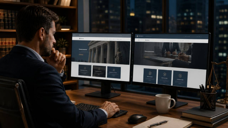
The gap between these two types of websites is visible when you look at the outcomes they produce. The credibility-focused website gets compliments from peers who visit it. The conversion-focused website generates inquiries from prospective clients who found it through search. For most law firms, the second outcome is more useful.
Understanding what separates the law firm websites that generate clients from those that don't — and what working with a law firm web design agency that understands conversion as well as design actually produces — is the starting point for making a website investment that pays for itself.
What Prospective Legal Clients Actually Do on a Website
Understanding how prospective legal clients use a law firm website helps clarify what the website needs to do well and what matters less than most firms assume.
Most visitors arrive through search — they've typed a practice area search or a situation-specific search into Google and clicked on a result. They arrive with a specific need in mind and they're assessing, within seconds, whether this website belongs to someone who can help them with that specific need.
They look at the headline. They look for practice areas that match their situation. They look for signals that the firm has experience with cases like theirs — specific content, case results, client testimonials that describe situations similar to theirs. They look for contact information. The entire decision about whether to stay on the page or go back to the search results takes approximately five to ten seconds.
If they stay, they typically don't read comprehensively — they scan. They look at headings, bullet points, highlighted information, and calls to action. The content that drives conversion is the content that speaks directly to their situation in language they understand, that answers the questions they have before they ask them, and that makes the next step — contacting the firm — obvious and frictionless.
This behavior pattern explains why many law firm websites underperform despite looking polished. They're designed for a visitor who reads carefully and evaluates comprehensively. The actual visitor scans and decides in seconds. The content hierarchy, the visual emphasis, and the call to action placement need to serve the actual visitor behavior, not the idealized visitor the design assumes.
The Design Elements That Drive Conversion for Law Firms
The characteristics that distinguish high-converting law firm websites from those that don't convert are consistent across practice areas, though the specific implementation varies.
Above-the-fold clarity. The section of the page visible without scrolling needs to communicate, within seconds, what the firm does, who it serves, and what the prospective client should do next. This area should not lead with the firm's history, awards, or philosophy. It should lead with a clear statement of what problem the firm solves and a prominent call to action.
Practice area specificity on the homepage. Prospective clients are looking for confirmation that the firm handles cases like theirs. The homepage should make it immediately obvious what practice areas the firm covers — not through a comprehensive list buried in navigation, but through prominent, visually clear practice area sections that allow the visitor to self-identify quickly.
Trust signals in prominent positions. Google review ratings and counts, bar association memberships, notable case results, years of experience — these belong in the visual hierarchy of the page, not in an about page that most visitors never visit. The visitor who is deciding in five seconds whether to stay on the page needs to see the trust signals in those five seconds.
Mobile-first design. The majority of legal website traffic comes from mobile devices. This has been true for years and is increasingly true. A website designed for desktop and adapted for mobile performs worse than a website designed for mobile first. The tap targets need to be large enough to use on a phone. The contact form needs to work smoothly on a mobile keyboard. The phone number needs to be clickable.
Looking at the best law firm websites that produce consistent inbound business reveals that they share these conversion-focused characteristics — not because they sacrifice visual quality, but because they've integrated conversion thinking into the design rather than treating aesthetics and conversion as competing priorities.
The Content Architecture That Supports Search and Conversion
A law firm website's content architecture — how pages are organized and what content each page contains — affects both search visibility and conversion.
The practice area page is the workhorse of a law firm website. Each major practice area deserves its own dedicated page — not a section of a generic services page but a standalone page that can rank in search results for practice-area-specific searches, that communicates the firm's specific experience with that type of matter, and that speaks directly to the concerns and questions of clients facing that specific situation.
Effective practice area pages have a consistent structure: a clear description of the practice area and what it involves, specific content that demonstrates the firm's experience and approach, answers to the most common questions clients ask about this type of matter, relevant social proof (testimonials, case results), and a prominent call to action that makes contacting the firm easy.
Attorney bio pages serve both credibility and search functions. A well-written attorney bio — one that communicates the attorney's experience, approach, and professional philosophy in language that a prospective client can understand and connect with — converts visitors who are evaluating the specific attorney they'd be working with. It also provides the text content that search engines use to understand the attorney's areas of expertise.
The Technical Foundation That Affects Both Search and User Experience
Technical performance — how fast the website loads, how it behaves on mobile devices, how it handles the technical requirements of modern search engine optimization — is invisible to the firm but highly visible to prospective clients and to search engines.
Page speed matters for both user experience and search rankings. A website that takes more than three seconds to load on a mobile connection loses visitors who bounced before seeing anything. It also ranks lower in Google's search results because Google uses page speed as a ranking factor.
HTTPS security — the padlock in the browser address bar — is both a trust signal to prospective clients and a ranking signal to search engines. Law firm websites that are not served over HTTPS are both less trusted and less visible in search results.
Structured data markup — code in the website that explicitly tells search engines what the content means — helps law firm websites appear with enhanced search result features like star ratings, FAQ answers, and practice area details directly in the search results page. These enhancements improve click-through rates from search results and produce more qualified visitors.
The investment in getting the technical foundation right produces returns across all other marketing activities — better search visibility, better conversion rates, better performance for paid advertising campaigns that drive traffic to the site. A law firm that is investing in marketing but hasn't invested in the technical quality of the website is building on a foundation that limits the return on everything else.
Post Comment
Share your thoughts about this article.
Be the first to post a comment!