Location intelligence has become one of the most aggressively expanding segments of analytics, and Placer.ai sits at the center of that conversation. The company presents itself as a way to interpret how people move through physical spaces in the United States, offering visit counts, trade areas, demographic patterns, and behavior signals without requiring a traditional GIS background. The pitch sounds valuable, but a closer look at user experiences shows a platform that is respected for convenience yet debated for the reliability of its underlying data.

Unlike many analytic tools that position their limitations quietly, Placer.ai is constantly scrutinized because its output directly influences decisions that can cost millions. Whether the platform delivers insight or simply a sophisticated approximation depends on how carefully users interpret the information.
How Placer.ai Frames Its Capabilities
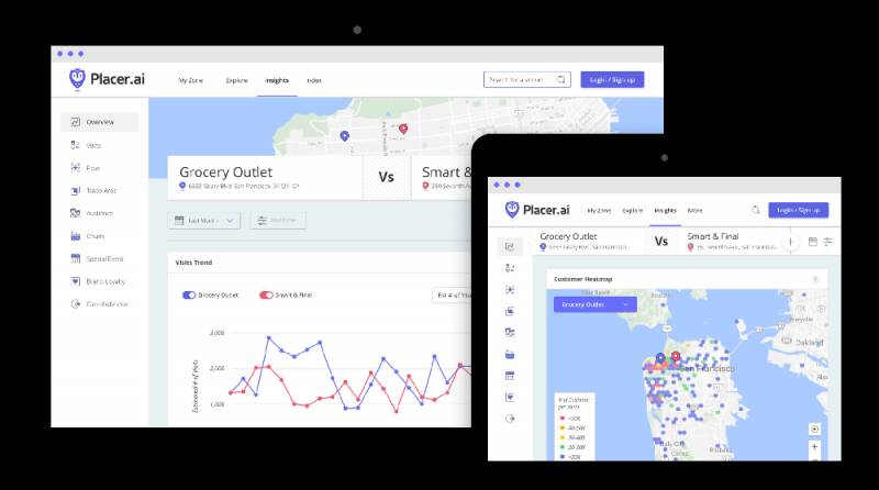
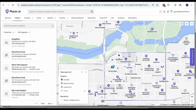
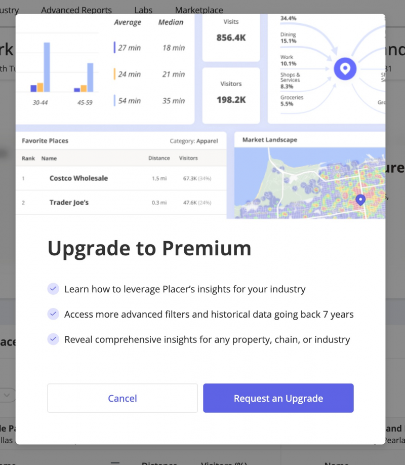
The platform attempts to combine anonymized mobile location signals, algorithmic modeling, and polygon level mapping in order to approximate real world movement patterns. In theory, this allows businesses to examine when people visit specific properties, how those visitors might behave, and how one location compares to another. The interface presents these interpretations in dashboards that are easy to navigate, although ease of use does not necessarily reflect the reliability of the underlying data.
Placer.ai’s structure centers on foot traffic counts, trade area definitions, demographic estimates, and predictive outputs. These pieces are delivered through dashboards, APIs, and data feeds, giving teams multiple ways to interact with the system. However, the usefulness of the tool depends far less on the variety of features and far more on the accuracy, sourcing, and transparency of the data driving those features.
What Users Actually Report: A Consistent Split Between Convenience and Credibility
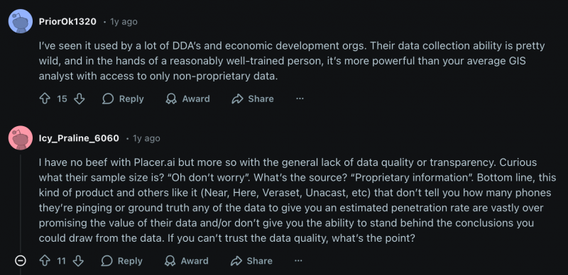
Public discussions, particularly on forums like Reddit, reveal that Placer.ai generates two distinct types of reactions. One group finds the tool extremely practical because it lowers the barrier to working with geospatial information. The other group focuses on methodological opacity, arguing that powerful visuals do not always guarantee dependable insights.
Many users praise the platform for giving immediate clarity about visitation patterns. Brokers and marketers, for example, often note that the tool allows them to observe seasonal shifts, campaign effects, or competitive movement without waiting for a data team. This ease of access is one of Placer.ai’s strongest qualities because it allows non technical users to make sense of spatial data that would otherwise require specialized software.
However, the praise is almost always accompanied by questions about panel size, sampling quality, and penetration rate. Several GIS practitioners explain that they cannot fully evaluate the precision of Placer.ai’s numbers because the company does not share how many devices contribute to its dataset or how representative those signals are across geographies. Some users report that the platform aligns closely with known counts for high traffic locations, while others claim that the numbers drift significantly for small stores, rural areas, or venues with irregular visitation patterns.
These conflicting experiences highlight the core tension: Placer.ai may be directionally useful while still being unsuitable for scenarios requiring exactness.
Patterns in User Sentiment
Below is a structured summary of the most common themes, based on user discussions rather than corporate claims:
| Observation | What It Suggests |
| Strong usability and clean dashboards | The tool appeals to non-technical users who would otherwise avoid GIS platforms. |
| Accuracy improves with high volume locations | Dense markets generate more stable signals. |
| Methodology is not fully transparent | Analysts cannot independently verify how representative the data really is. |
| Some users distrust foreign operated location companies | A minority raise geopolitical concerns, illustrating hesitations unrelated to product quality. |
| Sales experience varies significantly | Aggressive outreach is mentioned repeatedly, which may influence perception. |
These patterns do not condemn the product but make it clear that trust is not universally assumed.
A Closer Look at Strengths That Matter
The users who support Placer.ai emphasize strengths that go beyond surface level convenience. One of the most consistent points is the platform’s ability to replace manual geolocation workflows that many teams previously performed in GIS tools. For those without technical background, the value is not in the analytics itself but in the accessibility of those analytics.
Another noteworthy strength is contextualization. Placer.ai does not simply count visits but positions them within competitive landscapes, trade areas, and industry baselines. This contextual framing is what allows retail executives, civic planners, and developers to look at visitation trends and understand whether they reflect meaningful shifts or normal seasonal noise. In that sense, the tool excels at offering direction, even when its precision is debated.
Where Users Recommend Caution
The skepticism surrounding Placer.ai is not abstract. It is rooted in specific limitations that appear across reviews.
A recurring concern is the reliance on mobile device data, which inherently excludes segments of the population with limited smartphone usage or privacy restrictions. This creates the risk of panel bias, especially in regions where certain demographics opt out of location tracking more often than others.
Another issue is the assumption that foot traffic can be treated as a proxy for performance. Several experienced users warn that visit counts do not reliably reflect revenue, conversion, or operational stability. A store may receive significant traffic while still underperforming financially, and some real estate analysts point out that inexperienced users may misinterpret these numbers if they treat them as definitive indicators.
There is also mention of weaknesses in forecasting, with some users stating that Placer.ai’s predictive layers do not match the complexity or nuance of specialized modeling tools. When the platform is used to shape long term strategy rather than describe current behavior, its limitations become more visible.
Pricing and Market Fit
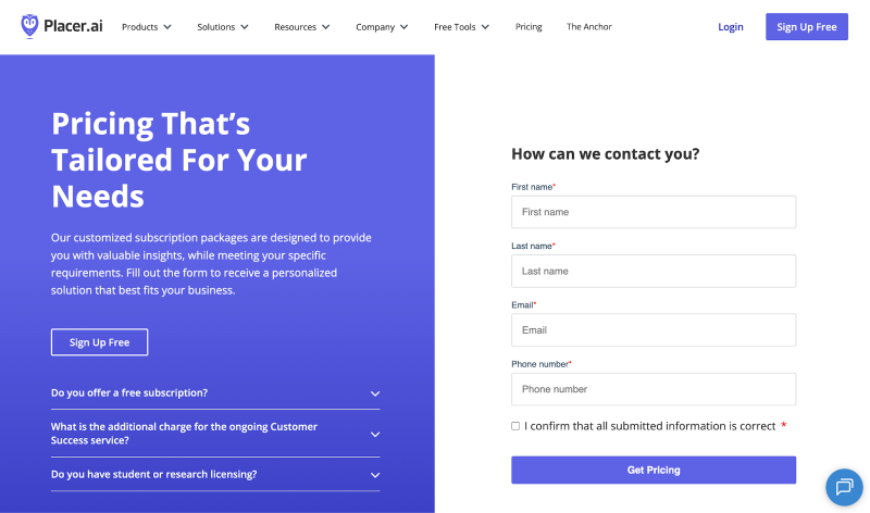
Placer.ai follows a custom enterprise pricing approach, which means organizations receive quotes based on size, industry, and use case rather than standardized tiers. This structure works for large retail chains or commercial real estate firms but can be restrictive for small businesses that do not have the budgets typically associated with enterprise analytics platforms.
Its market positioning suggests that the tool is intended for organizations where foot traffic has direct financial implications, such as retailers, developers, municipalities, and CPG brands. It is less appropriate for users seeking forensic level precision or those who require full control over data lineage.
A Measured Conclusion
Placer.ai is neither a miracle solution nor an unreliable gimmick. It sits in a middle ground where usefulness depends entirely on context. When used to observe patterns, compare markets, monitor seasonal shifts, or understand directional changes, the tool performs well and offers clarity that many teams lacked before. When users expect exact counts, transparent sampling, or precise forecasts, the platform becomes less dependable.
The most realistic way to view Placer.ai is as a pattern recognition instrument rather than a definitive measurement system. It reveals movement trends that would otherwise remain invisible, but those trends still require interpretation and, in some cases, external validation. Teams that understand this balance tend to benefit the most, while those who expect precision without limitation may find the platform disappointing.
Placer.ai helps businesses see the physical world more clearly, but it does not replace the need for critical thinking. The value comes not from the dashboard itself but from how responsibly the data is applied.
Post Comment
Be the first to post comment!